New Logo and Branding
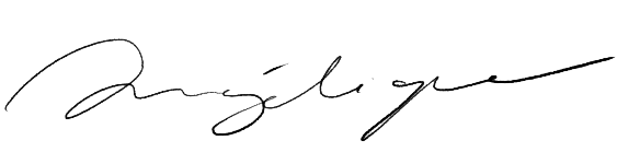
We are excited to announce that we have a new logo and branding! Some of you who have seen our growth from the start might think that the logo looks familiar. This is because we have previously used this logo exclusively on our in-house designs from the very first product we launched, our Canadian-made Wool Blankets. I hand-wrote “Nalata Nalata” in ink and had it woven as an embroidered tag to make it feel like a signature. It had always been different from our store and gallery logo with the coral orange slash which was, as mentioned here, selected for a very different reason! As our company evolved, we felt like the handwritten logo was more befitting of the nature of our work and wanted to shift fully to it for all our branding.
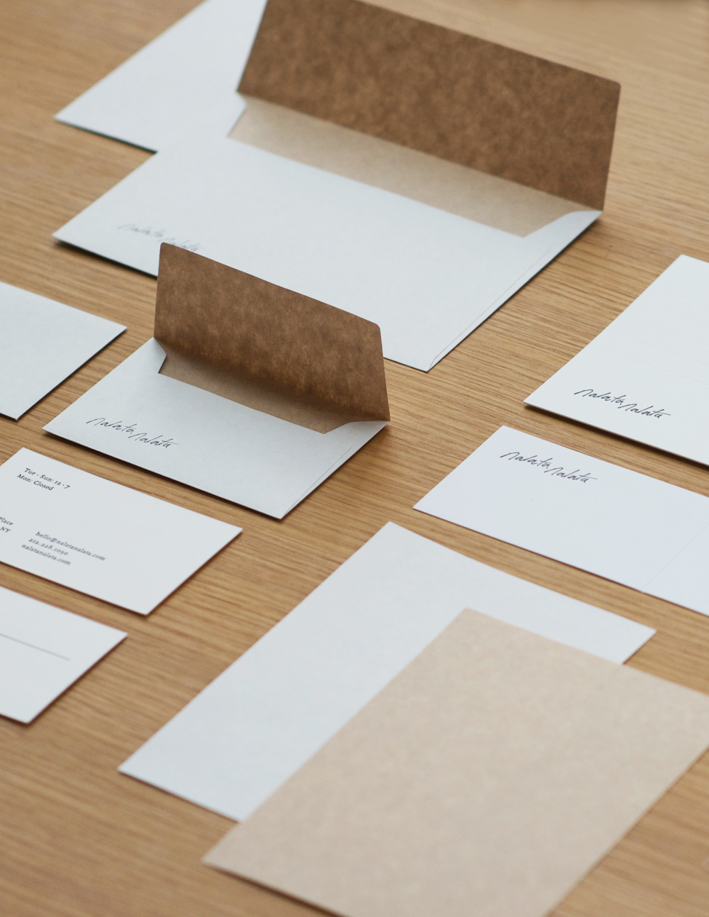
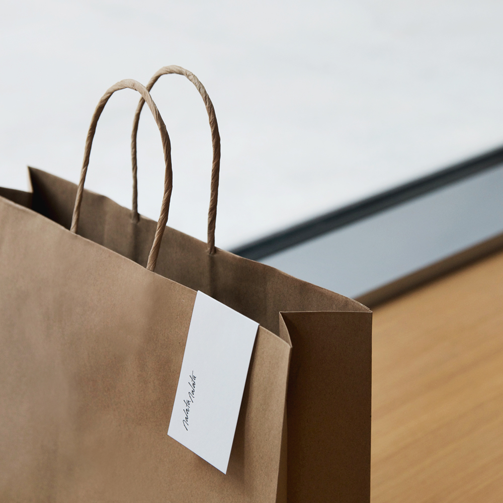
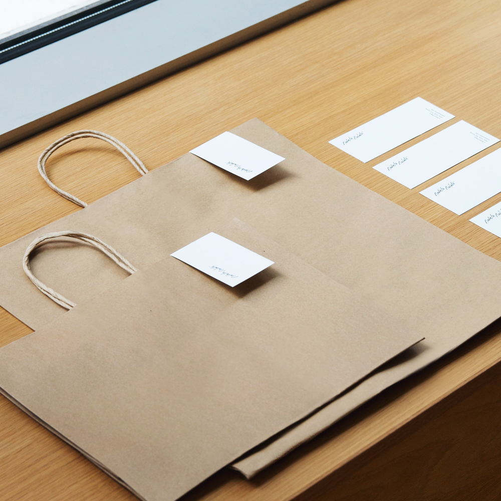
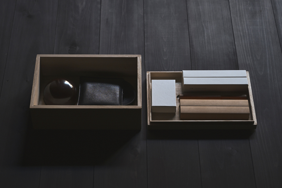
After all these years, we have finally transitioned to a singular logo with the help of our graphic design team, Studio Newwork, who refined the script and created a suite for everything from our storefront decals, email templates, letterhead, box packaging, gift cards and paper shopping bags. Since we are not big fans of loud branding to begin with, we knew we wanted something simple and human but above all, quiet to let the content speak for itself. The team understood this and achieved results that represents a big step for us toward a consistent brand identity – a pivotal moment we wanted to share because it is the very first time in our company history where all branding is unified. Logos, fonts, color palettes, etc., – consistent on all channels!
Before landing on the final logo design, we carefully considered options and went through many iterations with Studio Newwork but as is the way of the world, we came back full circle to the original idea – the one that felt the most intuitive – and that happened to be what we now affectionately refer to as our “signature logo”. We wanted something that was emotive of the handcrafted nature of the objects we curate, which often times take on human-like characteristics in our imaginations and product descriptions. It was only natural that Nalata Nalata had its own personality too and what better symbol of a unique identity than a signature used to represent yourself to the world.
It might not look like it but, oh my goodness, we spent over three months debating typeface choices. It’s a big decision because it’s used in all the areas of the website and on our branding materials from headers and titles, to short form body and long form body paragraphs. We also wanted something unique, but not something that took away from the content. We are very happy with the choice especially after learning about its history, how it has a serif and non-serif version, and how it translates well in digital and print. I’m sure a whole bunch of graphic designers will recognize it. Email guesses welcomed!
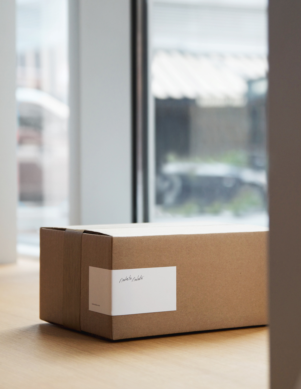
We have always been fascinated by the variation of paper choices available in Japan where the material is a deeply traditional art form. We spent a lot of time selecting the perfect paper weight, texture, and white tone for all the paper products that happen to be printed in Japan. The tactile nature of letterpress is hard to describe, but something that felt right for Nalata Nalata.
For all of you who are accustomed to our hand-drawn illustrations and notes when you purchase online – they’re not going anywhere! They have just been revamped with new branding elements and a paper quality that feels beautifully permanent in the hand. Maybe even keepsake-worthy of tacking to your fridge or taking up space in your home – a metaphor we like to expand to all the objects we send to you alongside each note.
We hope you like our new look as much as we do. Know that we put so much consideration into it only to create a better experience and build a better connection with each one of you.
July 15, 2021
Related Entries
The Philosophy of Nezen
We are excited to announce that we have a new logo and branding! Some of you who have seen our growth from the start might think that the logo looks familiar…
Elements of the Japanese Futon
We are excited to announce that we have a new logo and branding! Some of you who have seen our growth from the start might think that the logo looks familiar…

At Home with Ryuji Mitani – Containers for Daily Life
We are excited to announce that we have a new logo and branding! Some of you who have seen our growth from the start might think that the logo looks familiar…